A series of coincidences led me — a bright-eyed early 20-something theater major — to work on the Obama 2012 re-election campaign at its Chicago headquarters. My job largely revolved around the creation of website landing pages featured in campaign emails and social media posts. I remember being in awe of the incredible brains of the developers on my team. These people went on to work at Google, Uber, Nest, and the New York Times. And I’ve watched over the years as their campaign innovations became digital marketing standards adopted by all sorts of organizations across the country.
Presidential campaigns are the ultimate start-ups. Within 18 months an entire technical ecosystem is established, supporting thousands of employees and engaging nearly every American. These operations harness the latest technology and marketing tactics out of necessity. How else would they raise the unprecedented amounts of money necessary to mobilize voters? What’s more: the definite timeline and high stakes of an election encourage some awesome risk-taking.
In my humble opinion, all digital marketers need to pay close attention to the evolution of tactics each campaign cycle. It’s the best snapshot of the industry we have. What’s viable? What’s outdated? What’s overrated? The outcome of the election reveals all.
Welcome to our two-part series on the ways 2020 campaigns evolved digital marketing. In today’s post I’ll be covering targeted ads and branding. Let’s dive in.
Cheap, targeted ads broke the traditional model
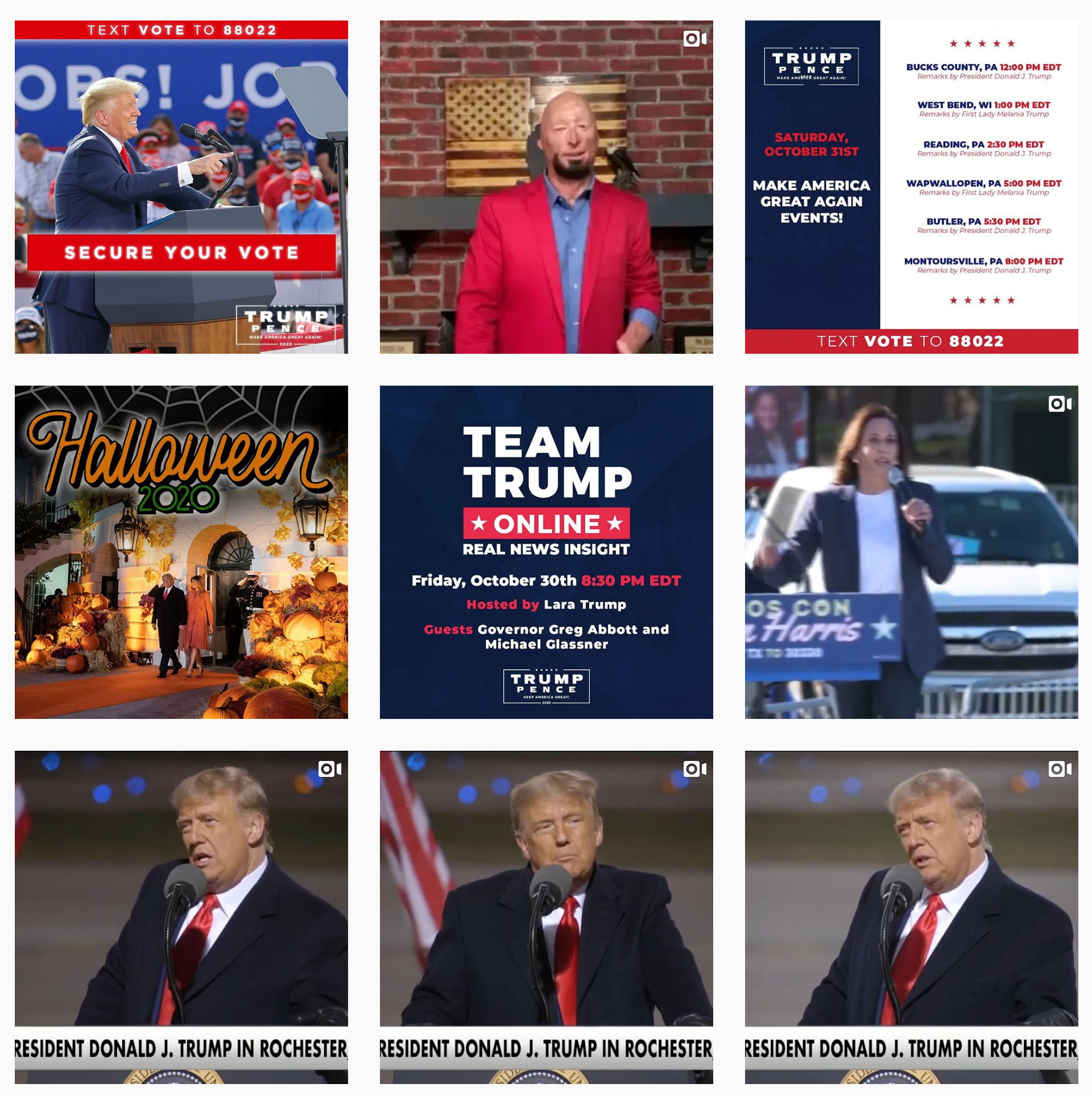
One of the main takeaways from the 2016 cycle — for better or worse — is that Trump’s team was genius for generating endless microtargeted ads. These ads largely played by the rules Google and Facebook established. They were often kind of sloppy but iteratively tailored for unique audiences.
While Hillary’s campaign allotted resources towards producing beautiful TV-style ads and promoting local events, Trump’s funneled a ton of money into low-dollar ad buys all across the web. These ads usually operated as fishing hooks to make sure the campaign identified as many Trump supporters as possible and captured their email contact information. It wasn’t particularly innovative, but operatives like Brad Parscale got a lot of credit for convincing campaign leaders to go all-in on the tactic.
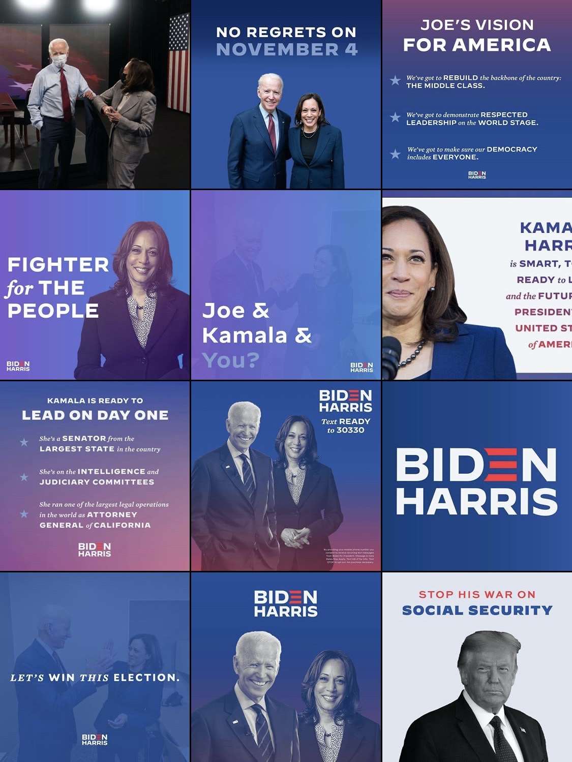
Leaders of the 2020 cycle didn’t have to be convinced. The digital ad teams on both sides were clearly working with larger budgets. I saw official campaign ads pop up on news sites, streaming services, social apps, and search engines.
One thing stood out to me: the ads I saw on digital platforms were often much different in tone and composition than the official tv ads, indicating I was being targeted by demographic attribute or interest. (Millenials don’t respond to the same content as Boomers, and sometimes it’s obvious when the algorithm has you pegged.) Between YouTube videos I routinely got served an official ad that was basically a slideshow about how much dogs love Joe Biden.
Only campaign operatives know how many official targeted ads were generated this cycle, but I feel safe in guessing it was exponentially more than 2016.
Simple Branding
I’m a design nerd, so I take logo choices too seriously. And I thought both 2020 campaigns’ logos were incredibly boring. I remember seeing Trump’s logo for the first time in 2016 and thinking it barely looked like a watermark. I remember seeing Biden’s logo for the first time during the primaries and laughing about how nondescript it was. But the joke is on me because these utilitarian brands got the job done.
Typically, brands want a logo to convey their personality and message. It’s a mistake to look at Biden and Trump’s respective logos through that lens. While both logos imbue a sense of strength and patriotism, they are exceedingly recognizable and legible.
Think of all of the different formats and contexts for a campaign logo. Campaign logos have to look good on yard signs, social media posts, busses, email signatures, t-shirts…. The list goes on and on. Over the past decade, it seems as though presidential campaigns are veering toward a single, simple logo lockup that can look good everywhere.
Think about how much praise the Obama 2008 rising sun logo received. It was full of meaning and detail. Over time, that sun logo was flattened down to its main shapes and colors in order to look great on digital platforms. But the Obama 2012 campaign continued to work with an expansive design language allowing its identity to adapt to new fonts, colors and shapes for different constituencies. For example, Latinos for Obama had an entire sub-brand that looked similar but different to the sub-brand of LGBT for Obama.
Hillary’s 2016 campaign took this direction to an interesting midpoint by featuring a highly recognizable but adaptable H logo. The H could be filled with photos and colors to recognize constituencies and holidays as needed. The H was recognizable in all contexts, but allowed some room for fun and personalization. Each battleground state had their own H filled with a famous local landmark.
Both Biden and Trump’s design teams stripped away most of the hallmarks of a design system down to the essentials: a single logo treatment, a few colors and a font or two. There were no battleground state logos. From the outside, I couldn’t recognize anything complex enough to be called a brand architecture. [Notable exceptions: One time they changed the Biden logo for Pride. Women for Trump is pink.]
And I think it worked fine. The K.I.S.S. principle (Keep It Simple, Stupid) ensured supreme brand consistency. While campaign materials might have lacked enough branding to be recognizable without a logo, you can be sure everything had a logo. The same logo. The campaign logo.
Did you notice any tactical changes this campaign cycle? Curious about how some of the 2020 tools could be adapted for a smaller organization? Team Tunheim loves to talk about digital marketing! Get in touch.
Read Part Two of this series, which focuses on the digital marketing tactics of video content, emails and texting.


